To Trollope-l
November 6, 2001
Re: An Eye for an Eye: A Single Illustration
Dear Everyone,
I don't know if I will be able to keep it up, but I thought I would try to describe the Folio Society illustrations to An Eye for an Eye as we go along. These descriptions are an attempt to stimulate discussion of the story based on the scenes, characters, and "take" on the story that the pictures singly and as a group depict.
This week there is only one illustration as the frontispiece to the volume illustrates one of next week's scenes.
It is a depiction of Earl and Lady Scroope in an intimate quiet, indeed downright cozy scene at the breakfast table one morning. It's coincidental that Elisa Trimby has chosen to illustrate just the aspect of this couple that Todd and I talked about: how are we to respond to this couple. Trimby's answer is somewhat sympathetically as a couple -- at least for now.
The caption is, "Don't you think, my dear, that something might be done to prevent Fred's returning to that horrid country". These are Lady Scroope's words and we see two very large, fully formed figures leaning, looming I would say, over a small round table which has a large teapot and one cup filled with tea on it. The cup is near the very elderly but kindly and patient looking man who sits on the left of the table. His hand, delicately done, rest on the table and he looks into the eyes of the lady His hair is wispish, sideburns are in evidence; a rich robe, slippers on his fetet. The look in the lady's eyes is attractive: her face is also drawn carefully, lots of lines; she looks calmly into her husband's eyes as she lifts her teacup to her lips. She too is dressed casually in a sort of soft jacket affair. The picture is not done in the gothic style of elongated shadows and shades of Castle Richmond. There is much white; no exaggerated forms; all rounded, prosaic in feel. To the back of them is a many-paned window; there are large sunflowers to the right above her (Folio Society An Eye for an Eye, introd. Maeve Binchy, illustrator Elisa Trimby.
This is an important moment. The Earl in fact will not pressure Fred in the slightest. This makes me think that he and his nephew have more in common than meets the eye. The narrator has said as much already: neither Fred nor his uncle is eager for conflict, contention. But would flow with the tide ... But we can't do this without harm in all situations.
Cheers to all,
Ellen
Re: An Eye for an Eye: Folio Society Illustrations in General and Pictures for Volume I of this novel
Thus far the modern illustrations for the Folio Society books I've looked at have been predominantly modern in spirit. Two illustrators chose pictures or drew them in a way which was Victorian: Kate Aldous's pictures for Is He Popenjoy? showed she chose just the kind of picture that is domestice, and scene that is not subversive but based on ideals that family rituals are meaningful that we find in the original Victorian illustrations to Trollope's novels: she only differed by a certain comic trivializing. Francis Mosley also emphasized a domestice Victorian take on John Caldigate, with the difference that there was much more emphasis on the Australian characters and scenes: he drew serious monumental forms.
Two gave more of a modern take. For Ayala's Angel Robert Geary gave more of a modern take by his repeated use of romantic picturesque scenes and a real fondness for the art "outlook" of Dormers; the prettiness of the pictures suggested the kind of thing one gets in modern romantic comedy movies. If something other than fame (brand-name-ness) pushed movie-makers in their choice of Trollope's novels to adapt for films, Ayala's Angel would make a lovely perhaps money-making picture. Of course they'd have to change the title: that coy "angel" would never do. For The Kellys and O'Kellys, the illustrator took the figures seriously, and I suspect is unlike what a Victorian illustrator would have chosen as it respects the Irish landscape, and presents the story as serious drama.
Of the above four I found most pleasing the set for Ayala: the lovely picturesque scenes of London are alluring to me -- as well as the very romantic takes of the two central couples and that final picture of Ayala and Lucy visiting Lucy's beloved's art studio to stare at an enormous male nude.
None are as interesting as Rod Waters' expressionistic illustrations for Castle Richmond which took out of the story the vein of dark gothic and desperate romance that gives passion to the book. These are a wholly modern set, and what makes them remarkable is the take and the harsh elongated dramatic stylization which recalls the popular illustration of 19th century Irish novels about the famine and other crises
Elsa Trimby's illustrations return us to the compromise found in Popenjoy?, Caldigate, Ayala and Kellys. The choice of pictures is deeply sympathetic to Fred's romantic impulse and love of landscape, and shows a decided preference for the untitled Irish characters and their plain home life to the English "toffs" (what a hideous word) who inhabit Scroope Manor. Had an insight and therefore style emerged more like Waters's the scenes at Scroope Manor would have been gothic. I'd like to share a student journal-essay written by someone in one of my classes; it is heavily influenced by what she heard in class, and I helped her revise it, but her thesis about the landscape and romance in the novel as gothic is mixed with her own ideas about how the setting influences the characters in the book.
Trimby didn't see this, and the illustrations are as a result somewhat dull. Trimby's illustrations show us round prosaic kindly figures, country people. In a set of 8 one is given over to one of the tenants standing before a cabbage on Scroope Manor (Folio Society, An Eye for an Eye, illus Elsa Trimby, p. 82 and facing illustration): I can see him in an ad for travelling through the country in the 1930s, the way J. R. Priestley (who wrote Angel Pavement and The Good Companions) is sometimes understood. There's a picture of a round Kate writing a letter which gives her a happy mischievous look in her eye; attention is paid to a curly-hair do and overstuffed dress (p. 74 and facing illustration). Instead of the intense desperate agonized Earl Scroope, we get a picture of an old man on a bed who look week and feeble but again relaxed, with a fond expression in his face, weary (p. 60 and facing illustration). This one is interesting because the room is made much poorer than it would have been, though probably the bedding, the hat on the man's head and his nightgown are accurate enough. The pitcher and bowl standing on nearby nightstand, with a bottle of medicine in the room could have been drawn from my mother--in-law's house in Southampton as it probably was in the 1920s and 1930s.
The breakfast scene between Earl and Lady Scroope that I described when we first began our read and is the first illustration of the series fits right into this pattern. It strikes the domestic well-meant prosaic note.
In other words, I haven't been describing these pictures because I think they are inadequate: they are not the take the bourgeois English reader apparently had on the book which probably Simon Raven's essay repeats in modern terms. They are not the intently moral take of Richard Holt Hutton. They are not the gothic one I suggested in my first posting the week we began. They are directed at some notion that the reader of this book might like to see illustrations of Irish landscape with poorer and plain country types in the scenes . It is an attempt to fit this book into a preconception of Trollope that is imagined the average reader has.
This notion of an average reader does not withstand scrutiny whenever you really get to talk to people and when on rare occasions they might just tell you what they have felt and thought when they read a book. We do some of this here though what we say is always shaped by our the public and invisible nature of our forum.
This is not to say the illustrations are irrelevant. Some do enrichen the text. They do depict a wild country landscape, rural. When Fred comes to visit Kate, we see a full-scale depiction of a cottage: it could come from some sentimental depiction of Hardy in mood, but the details are interesting: Fred is dressed in elegant-shabby kind of workclothes; in a corridor on the side of the door he stands next to are hens, a basket of wash, a broom, a gaslight-looking object comes out of a wall. On the other side we see an older woman in a rocking chair by the fire; above her hangs her wahhs. Kate sits by a table; she's sewing. Again she has a very odd expression on her face, intense yet hidden but as if she's fending off some intruder yet wants him in. Not at all the innocence Trollope's text suggests; Fred looks earnest, well-meaning, much less "louche" than Trollope's. It's the objects that are of interest here (p. 40 and facing illustration). There's another similar one of Kate hanging out the wash (p. 52 and facing illustration).
In the next paragraph to make a point I do tell the ending of the story. I want to say why two pictures are particularly well-chosen in this series.
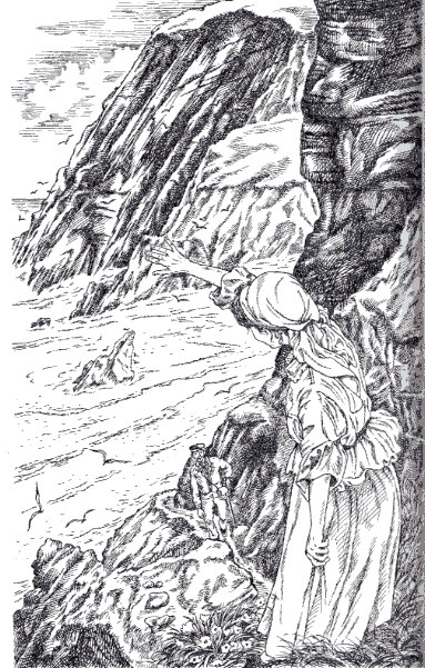
There are two very good pictures in the sense of choice. Both depict the cliffs and give us a sweeping vision of the waters into which Mrs O'Hara will fling Fred at the close of the story. It is true that Trollope opens Chapter 5 (the first in the book's intended second installment) with a long meditation on this spot, that he returns us to it obsessively, and that this week's chapters as the previous emphasize Mrs O'Hara's intense anger, how she feels about the world now after a lifetime of living in it, and how dangerous she is -- how Fred is playing with someone who will get back if this last treasure she has left to her is exploited and cast aside.
The first is the frontispiece to the volume:
The other illustration, really the best thus far is a depiction of Ardkill Cottage from a bird's eye view:
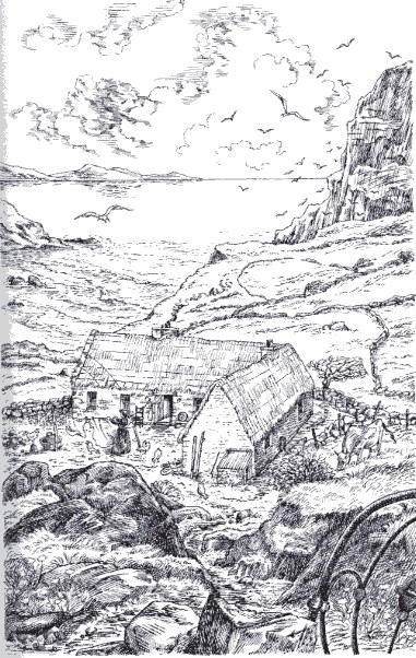
Imagine yourself in a plane not too high passing over a largish l-shaped cottage which is sited on the edge of a cliff. You glimpse a woman hanging up her wahsh, around her are hens and chickens. She has a now empty clothes-basket near her feet (p. 30 and facing illustration). The caption is like most of the captions for this book the shortest sort of line which gives the illustrator an excuse to draw something. In several of the other cases she draws something that is not to the purpose of the real inner life of the text in front of her at all; but this one is to the purpose for Ardkill Cottage counts. Note the slight allegorial suggestiveness: Hard Kill Cottage. There's a sardonic joke: a hard kill is what Fred is going to know; a hard kill is what Mrs O'Hara has known all her life, for what was beautiful in her has been twisted into a repressed ability to kill, to get back.
Trimby again shows us a serene backdrop. A wide sky, calm waters, the seagulls, to the right yet higher cliffs. One sees rocks the bottom edge of the picture; they lead down to the cottage. This is Fred's way down; we are seeing what he saw and drew him in.
What's interesting here is the sense the picture gives us that Fred could not possibly know what he is getting himself into. Trollope makes that point. Oddly Fred is an innocent: he has led such a privileged life how can he know how others feel about this society which demands of him he be a Prince and in return asks that he take for his Princess someone the society chooses for him. In that sense we can feel some pity for the rationalizing self-indulgent but loving young man. Trimby's decision to give Fred such a sympathetic earnest face but half-unconscious of itself has some point. This is a series of pictures which are sympathetic to Fred and Kate and what happens in a way Trollope probably didn't expect: a democratic impulse is at work, and perhaps here we have disclosed to us one way the book may be read today sociologically, one which tries to make it fit into modern preconceptions which will make society and human nature less hard & enigmatic, downright treacherous, than Trollope's novel projects. The Irishness of Trollope's novel is not in the details of the landscape but its inner mood.
Cheers to all,
Ellen Moody
Date: Sun, 18 Nov 2001
Dear all
I enjoyed Ellen's discussion of the illustrations to the Folio edition of An Eye for an Eye. In the last few days I've received a copy of this edition I ordered online (I previously borrowed the Oxford World's Classics edition from the library, but wanted my own copy) and I was initially dismayed at Elisa Trimby's illustrations. To me they seem somehow too pretty and fussy for the text, and are just not how I would imagine Fred and Kate - to be honest, they remind me of greetings cards.
Reading Ellen's discussion, I can see there is more in these pictures than I thought at first, and I agree the bird's-eye view of the cottage is a striking image - but I have to agree that the pictures are wrong for the story and don't capture the Gothic mood described in the student essay.
I like this edition all the same, because of the quality of the paper and the print and the feel of it in my hands - but the brooding romance of the book seems to cry out for "dark plates" rather than all this light, to me anyway.
Bye for now
Judy Geater